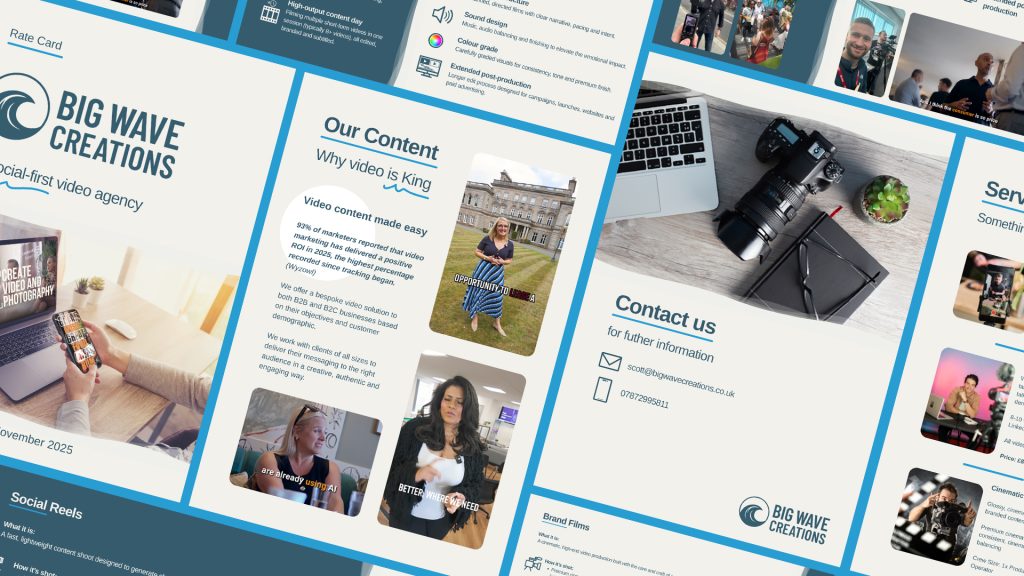

I was brought in to create a series of social assets and supporting documents for Meta, LinkedIn and Canva, with the aim of clearly communicating the difference between two key services, Brand Films and Social Reels.
The approach was to strip everything back and focus on clarity. Starting with the fundamentals, I worked to define each service in its simplest form, identifying the key components that set them apart and shaping these into a clear visual narrative.
At the core of the solution was a one-page comparison that positioned both services as distinct offerings, each designed for a different purpose. Social Reels were framed around speed, flexibility and high-volume content creation, using a lightweight setup. In contrast, Brand Films were presented as a premium, cinematic product, built around a dedicated crew, a story-led approach and extended post-production.
Alongside this, I elevated the brand identity by creating a set of distinctive iconography to support the messaging. These icons were designed to visually represent key elements of each service, adding clarity, consistency and a recognisable visual language to the client’s asset library.
The creative process focused on reducing complexity, using concise messaging and clean visual structure to make the information easy to understand at a glance. Layout, hierarchy and typography were carefully considered to guide the viewer through the comparison in a logical and engaging way.
This thinking was then translated into a suite of assets for social and internal use, ensuring consistency across platforms and making the messaging adaptable for different formats.
The result is a clear, cohesive set of visuals that communicate the differences effectively, helping to guide decision-making and create a more streamlined creative process overall.