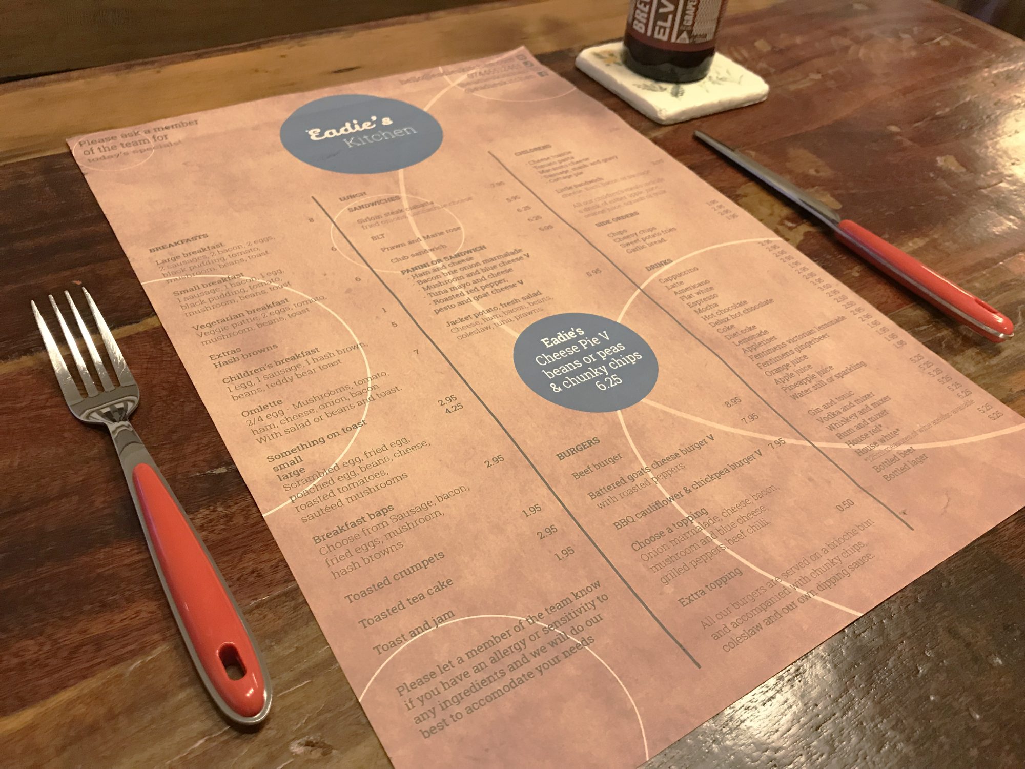
I partnered with Eadie’s Kitchen, a vibrant café in Burnley, to establish and build upon their brand identity. The project began with designing a warm, inviting logo that captured the welcoming essence of the café. Once the core identity was locked in, I rolled it out across their essential daily collateral, designing clean, engaging layouts for both their main dine-in menu and their takeaway options.
As the business expanded, I helped them visually define a new branch of the company: Eadie’s Brownies. This brand extension needed to feel distinctly its own while staying true to the main café’s roots. To support this sweet new venture, I designed bespoke thank-you cards for their customer orders and a striking, large-format banner for their market stall, ensuring they caught the eye of passing trade at local events.
To add an extra layer of personality and unify the team, I also illustrated a custom character mascot specifically for their staff clothing. From the menus on the tables to the uniforms behind the counter and the branding at pop-up events, this project demonstrates how cohesive, scalable design can elevate a local business across every physical touchpoint.


Looking to build a brand with real personality? Let’s make it simple – and make it stand out – Get in touch now.